Affichage des articles dont le libellé est Grunt. Afficher tous les articles

10 avr. 2014

Famo.us has landed on Github

Just hit: https://github.com/Famous/famous

Some documentation are available here: https://github.com/Famous/guides/tree/master/dev

Install it and start using thanks to NodeJS, NPM, Yeoman, Grunt and Bower:
npm install -g generator-famous
mkdir newProject
cd newProject
yo famous
grunt serve

9 mars 2014

Integrate your responsive images in one line in your HTML: the Clowncar's cookbook

Introduction

This is just a post from a cookbook that I've integrated into grunt-clowncar plugin a few month ago.

This technique for handling responsive images without polluting your HTML's code has been first mentioned by Estelle Weyl. It's like an abstract factory pattern for responsive image.

The goal is to create automagically an SVG file (the clowncar) which acts as a container. You just include the SVG file whenever you need responsive images. The SVG files contains all the necessary redirection to all the images and it loads only the appropriate ones.

Here is my original cookbook that I simply repost hereafter.

Preparing the circus

First thing first, we import the necessary tooling.
This cookbook has been created using OSX. But there's no hassle doing it with your operating system of choice.
With your favorite terminal, hop into an empty directory and create a package.json file for your project, if it's not already done.
npm init
We are using the following directory structure:
.
├── Gruntfile.coffee
├── dist
├── package.json
├── src
│   ├── img
│   │   └── photo001.jpg
│   └── index.jade
└── tmp

With :
  • Gruntfile.coffee: Our Grunt file in coffee.
  • dist: A directory for our generated web files.
  • tmp: A directory for temporary files (unminified stuff, for instance).
  • src: A directory containing all our source files that need treatment.
  • src/index.jade: The main jade file that generates our index.html file.
  • src/img: A directory containing all the image that we are about to clown.
Note that the folder strucure is easily adapted in the grunt file provided hereafter.

Now, we import our grunt plugins and a some other neat stuff:
npm install --save-dev grunt grunt-clowncar \
  grunt-contrib-jade grunt-svgmin grunt-contrib-clean \
  grunt-contrib-watch grunt-express grunt-contrib-copy \
  grunt-open matchdep

And, if you haven't done it already, install GraphicsMagick system wide. Here's the command on OSX for convenience:
brew install graphicsmagick

OK. Now, we can proceed with the 1st recipe.

Embedded SVG in HTML code

So, we start with our Grunt file Gruntfile.coffee which should look something like:
# Grunt tasks
module.exports = (grunt) ->
  # Load all plugings from our package.json files
  require('matchdep').filterDev('grunt-*').forEach grunt.loadNpmTasks
  # Project configuration
  grunt.initConfig
    # CLOWNCAR
    # Here comes the fun part. Your image are going to be clowned!
    # Every image stored in 'src/img' produces an SVG file and all
    #  the resolution required by responsive image depending on the
    #  screens that you are targeting.
    # Hereafter, the sizes matches the ones from the default
    #  Twitter's Bootstrap CSS framework.
    # Feel free to adapt them to the screens that you are targeting.
    # All our produced stuff go in the 'tmp' dir as some additional
    #  and optimizing steps are required for our beloved mobile users.
    clowncar:
      options: sizes: [1280, 992, 768, 400]
      all: files: [{
        expand: true
        cwd: 'src/img/'
        src: ['*.jpg']
        dest: 'tmp/'
        ext: '.svg'
      }]
    # Minify the produced SVG (our clown cars).
    svgmin:
      options: datauri: 'base64'
      clowned: files: [{
        expand: true
        cwd: 'tmp/'
        src: ['*.svg']
        dest: 'tmp/minified/'
        ext: '.min.svg'
      }]
    # Copy our multi-resolution images (the clowns under the car)
    #  to our production dir 'dist'.
    copy: clowned:
      expand: true
      cwd: 'tmp/'
      src: ['*-*.jpg']
      dest: 'dist/'
    # Use jade to produce HTML.
    jade: compile:
      options:
        # Minify our produced HTML file automatically.
        pretty: false
      files: 'dist/index.html': ['src/index.jade']
    # Remove everything created so far.
    clean: [ 'dist', 'tmp' ]
    # Create a custom Express server on the fly.
    express: all: options:
      port: 9000
      hostname: '0.0.0.0'
      bases: ['dist/']
      livereload: true
    # Open a browser when site is ready.
    open: all: path: 'http://localhost:<%= express.all.options.port %>'
    # Watch every changes in the 'src' dir and fire up the buuild task.
    watch:
      options:
        # Note: Livereload is not set in this task as it's already provided
        #  by the express server (the grunt task).
        livereload: false
      all: files: 'src/**', tasks: ['build']
  # Build tasks.
  grunt.registerTask 'build', ['clowncar', 'svgmin', 'copy', 'jade']
  # Default task.
  grunt.registerTask 'default', [
      'clean', 'copy', 'build', 'express', 'open', 'watch'
    ]

Pfeww, that was long. But, we've provided you with a real world example with comments. Comments that should be worth reading.

Note that there's no need in minifying our produced image with grunt-contrib-imagemin. grunt-clowncar does it for you. It uses GraphicsMagick's 'convert & thumbnail' feature that does the job pretty well.

So, the produced SVG (the clown car) are in the tmp/minified dir. On the other hand, the responsive images (the clowns or the reduced JPEGs) are directly provided in dist, the production dir. Let's target these with a neat HTML file written in Jade:
- var pageTitle = 'Check the clowns'
!!!5
html
  head
    title= pageTitle
  body
    h1= pageTitle
    include ../tmp/minified/photo001.min.svg

That's it! A oneliner for every included image.

Now, just hit the grunt command and watch your image being clowned:
grunt

Check the dev tools to see the image downloaded from the server while redimensioning your browser.

28 déc. 2013

Automated splascreens for mobile and tablet applications

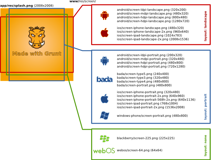
When creating mobile or tablet applications, your assets take time to load. Wether you prefer native or hybrid development, you end up customizing splashcreens for each of the screen resolutions, layout modes (portrait or landscape). This work is a bit cumbersome and no responsive technics exist in this field.

I have come up with a nice solution that takes a single PNG file as input. This file must be designed with every constraints in mind. Therefore, I also provide a canevas that helps out its creation:

Once done, using Grunt and my plugin grunt-phonegapsplash, creating all your required splashscreens is a matter of a single command line.

Here is the basic workflow that it automatically handles for you :

The canevas and the source file are available on Github. The plugin is easily installed via npm.

26 déc. 2013

Créer des icônes d'applications pour tablettes et mobiles à partir d'un SVG

A chaque fois que vous ciblez un nouvel OS pour applications mobiles et tablettes, il est nécessaire de produire plusieurs types d'icônes. Pour alléger ce travail fastidieux, j'ai publié un plugin pour Grunt.

Un petit graphique vaut mieux qu'un long discours :


Ce plugin s'appelle grunt-svg2storeicons. Son code source est disponible sur Github et disponible sous la forme d'un module npm.


15 déc. 2013

Faciliter l'intégration d'images responsives avec Grunt

Dernièrement, j'ai eu l'occasion de travailler avec Shiawuen sur une technique appelée Clowncar. Cette technique permet une intégration simple de vos images en mode responsive  : en fonction du périphérique (ordinateur, tablette ou modèle de smartphone), seul l'image dans sa résolution la plus appropriée est chargée. Cette technique est basée sur les articles d'Estelle Weyl.

En quoi consiste cette technique et ce plugin Grunt ?

Et bien, c'est assez futé et simple. Vous centralisez toutes vos photos (ou image pour votre site) dans un unique répertoire. Grunt et le plugin Grunt-Clowncar vont automatiquement créer un fichier SVG par photo (le 'car') et des miniatures (les 'clowns') de ces photos pour chaque résolution des périphériques visés.

Dans chaque SVG se trouve des directives de type media query permettant de pointer vers les miniatures en fonction des périphériques.

Au global, vous insérer les fichiers SVG tels de simples images dans votre page web. Automatiquement, le navigateur de votre périphérique ira chercher la miniature correspondante de la photo : la miniature est la plus appropriée à votre résolution. Nous sommes bien dans le cas d'images responsives mais en ne faisant qu'une petite ligne de code. Simple et efficace.

J'ai fait un petit 'livre de cuisine' (un cookbook) dispo ici : https://github.com/shiawuen/grunt-clowncar#cookbook.