Affichage des articles dont le libellé est SVG. Afficher tous les articles

27 juin 2015

PDF your collections, client side

Introduction

There are many ways to produce PDF on a website. You can use server side solutions for creating PDF, create CSS styles for print (and cross your finger waiting that all browser vendors will implement it) or create PDF on the client side. The two last solutions having the advantage not to take too much CPU on your infrastructure.

Leveraging PDFKit and SimpleSchema

PDFKit provides an almost complete isomorphic solution for that. It allows you to choose where you want to implement your PDF creation. Very nice. Unfortunately (or not), it only comes with low drawing primitives and for creating your PDF you will need some serious work on it.

When creating templates and forms for our collections, most of us are relying on Autoform. This solution is so nice that we tend to forget how incredible the amount of work this solution is doing for us. We just create a SimpleSchema of our collection and now we can display them, fill them, check the integrity of data provided by our users, and so forth. An incredibly productive package suite.

What if we could do the same for our PDF? That's what I was needing for a client. A solution that could take collections and create PDF out of them.

PDF Renderer

I've outsourced this solution in a package called pierreeric:pdfrenderer. Let's see a simple example on how to use it.

First, we start creating our classic collection with a SimpleSchema. We tag the fields that we want to see in our PDF using a simple pdf: true attribute:
CustomerSchema = new SimpleSchema
  name:
    type: String
    label: TAPi18n.__ 'name'
  images:
    type: String
    label: TAPi18n.__ 'images'
    optional: true
    autoform: afFieldInput:
      type: 'fileUpload'
      collection: 'Images'
  address:
    type: Object
    label: TAPi18n.__ 'address'
  'address.street':
    type: String
    label: TAPi18n.__ 'street'
    pdf: true
  'address.city':
    type: String
    label: TAPi18n.__ 'city'
    pdf: true

Customers = new Mongo.Collection 'customers'
Customers.attachSchema CustomerSchema

if Meteor.isServer
  if Customers.find().count() is 0
    Customers.insert
      name: 'Mathilde Charpentier'
      address:
        street: '227, rue Camille de Richelieu'
        city: 'Strasbourg'
  Meteor.publish 'customers', -> Customers.find()

if Meteor.isClient
  Template.svgTest.onCreated ->
    sub = @subscribe 'customers'
    @autorun =>
      if sub.ready()
        @customer = Customers.findOne()
  Template.svgTest.helpers
    customer: -> Template.instance().customer
Now for creating the PDF when the user click on a button, we can pass to the PdfRenderer some fields or the complete collection:
if Meteor.isClient
  Template.svgTest.events
    'click button': (e, t) ->
      # Create the initial PDF document
      pdf = new PdfRenderer size: 'a4'
      # Load all required assets
      pdf.addAsset "/cfs/files/images/#{t.customer.images}" if t.customer.images
      # Use reactivity for loading assets if any
      t.autorun ->
        if pdf.ready()
          # Customer image if exists
          if t.customer.images?
            pdf.img "/cfs/files/images/#{t.customer.images}", 'RIGHT',
              width: 100
          # Customer's name
          pdf.h1 t.customer.name
          # Address of customer
          pdf.h2 TAPi18n.__ 'address'
          pdf.schema CustomerSchema, 'address', t.customer
          # End the PDF document, display it and enable back the PDF button
          pdf.finish "file-#{t.customer.name}.pdf", ->
            console.log 'PDF finished'
You can see a rendered PDF in the Github repository.

Conclusion

This example is pretty simple. It could be enhance with theming and templating. Coupled with a CMS like Orion, this could be an interesting block for covering e-commerce solution with automatic catalogue creation, web magazines with press capabilities, bookkeeping with automatic invoices generation, ... Hope you will like it and share your contributions on this little package. Happy coding.

19 avr. 2015

Fullscreen D3 graphs

What are we going to tackle?

When creating D3 graphs, the more graphs you put in your page, the less readable it tends to be. A friend of mine advise me to set my graphs in fullscreen. I immediately loved the idea. That would definitely help users to focus.

What do we need to solve?

  1. Our graphs need to be responsive: when they will be toggled on fullscreen, they need to expand and take as much space as possible.
  2. When setting up fullscreen, the viewport is black despite all your already setup styles.
  3. Tooltips on your graphs needs to be included in the fullscreen's viewport.
  4. As your viewport is changing so are the references on where your tooltips needs to be displayed.

Piece by piece solution

First, let's setup our markup in Jade. figure is our SVG container, the div, .svg-content, is where D3 will place our SVG content and the div, .tip, is our tooltip for this graph:
figure
  .svg-content
    .tip
      span Point
      .arrow
Now, we need to setup our style so that our SVG content takes the available width of its container or the width of the viewport when it will be set on fullscreen. Note that we also need to set the background color of the container so that we don't end up with a black viewport. Here is the relevant extract of the Sylus file:
// Container for responsive SVG
// Mixin for creating SVG container with specific aspect ratio
svgContainer()
  display inline-block
  position relative
  width 100%
  vertical-align middle
  overflow hidden

figure
  display inline-block
  absolute top left
  height 100%
  margin 0
  // This container targets 1:1 SVG
  svgContainer()

  .svg-content
    // Here are the properties for the fullscreen content
    &:fullscreen
      size 100%
      background white
For the tooltip, we use a fixed position that will be modified using our logic. The style is pretty straightforward in Stylus:
.tip
  fixed top left
Now, for creating a responsive D3 graph, we need to use the preserveAspectRatio and the viewBox attributes on the graph instead of the regular width and height on the SVG tag. This is what is done by the following logic in Coffee on a 100x100 graph:
svgWidth = svgHeight = 100
svg = d3.select '.svg-content'
  .append 'svg:svg'
    .attr 'preserveAspectRatio', 'xMinYMin meet'
    .attr 'viewBox', "0 0 #{svgWidth} #{svgHeight}"
Setting the graph in fullscreen is eased thanks to screenfull.js. This library provide a cross browser API of the vanilla JavaScript Fullscreen API:
Template.home.rendered = ->
  @fullscreen = ->
    return screenfull.exit() if screenfull.isFullscreen
    target = (@$ '.svg-content')[0]
    screenfull.request target

Template.home.events
  'click button': (e, t) ->
    $button = t.$ e.target
    role = $button.attr 'data-role'
    t.fullscreen() if role is 'fullscreen'
Now, we need to adjust the tooltips so that they are positioned properly. In our example, we are using a Voronoï diagram. Hovering on the path elements of the Voronoï is triggering the tooltip of its points modeled by circle elements. Getting the position is achieved thank to the DOM API getBoundingClientRect:
  tip = @$ '.tip'
  @positionSetTip = (circle) ->
    rect = circle[0].getBoundingClientRect()
    tip.css 'transform', "translate3d(\
      #{rect.left + .5 * (rect.width - tip.width())}px,\
      #{rect.top - tip.height()}px, 0)"
  @showHideTip = -> tip.toggleClass 'show'
  @showTip = -> Meteor.setTimeout (-> tip.addClass 'show'), 300
  # A debouncing function is used for transitioning over path
  @lazyShowHideTip = _.debounce @showHideTip, 300
  path = svg.append 'g'
    .selectAll 'path'
  svg.append 'g'
    .selectAll 'circle'
    .data vertice
    .enter()
    .append 'circle'
      .attr 'transform', (d) -> "translate(#{d.toString()})"
      .attr 'r', 1
  data = path.data (voronoi vertice)
  data
    .enter()
    .append 'path'
      .attr 'd', polygon
      .order()
      .on 'mouseover', (d, i) =>
        circle = $ "circle:nth-child(#{i + 1})"
        @positionSetTip circle, i
        @showTip()
      .on 'mouseleave', =>
        @lazyShowHideTip()
  data.exit().remove()

Some links

Bonus

On the demo, I've also added some features like:
  • An animated tooltip: when entering or leaving a small animation is done.
  • The Voronoï graph is animated using a simple random function.
  • Key events are handle to let you set the graph in fullscreen or to animate it.
Happy coding!


7 déc. 2014

3D hardware accelerated SVG using famo.us and Meteor

One of the main problem with SVG for Android or Chrome, desktop and mobile, is the lack of hardware acceleration. Multiple issues also prevents some nice effects like skewing for instance. Making smooth animated SVG in a browser or in Cordova tends to be tricky.

As stated in one of my former blog post, famo.us makes a good candidate for removing this pain and Meteor, with its famous-views package, makes a good candidate for tying up everything together.

This weekend, I've started working on a famous-views's plugin named fview-svg. Basically, it reads your SVG as template and create famo.us's Surface and StateModifier out of it. One of the sensitive parts of the process was the inverted coordinate system of SVG compare to DOM and SVG's responsive nature. But the beauty of making it a plugin with famous-views is that it will be available for anyone. Nice.

Here is a little video that demonstrates my first demo with fview-svg:

As you can check it in the source code, without the comments, this demo is less than 20 lines of codes. And there is room for improvements.

I've deployed a live demo and you can play with it: fview-svg.

I've tested on desktop in Safari, Chrome, Firefox and Opera. On iOS8, I've tested it, an iPad Mini, an iPad 2, an iPhone 5S. On Android, I've tested it on release 4.4.2 on a Samsung Galaxy Tab and on release 4.0.3 on an HTC Desire C. And this is this last test that just surprised me. You may not even know what this terminal is. It's a low end smarphone. Very cheap. A single core under 1GHz. What Android call a midpi. These terminals still equip a large portion of Android's market share. Just to give you a glimpse on these terminals, it doesn't even run the first Angry birds properly... And here, the SVG animation was perfect. Fluid. I almost shed a tear.

The source codes of the plugin as well as a tutorial for recreating this demo are available on Github:  fview-svg.

Note: The plugin is not already available on Atmosphere, the official Meteor repository. I wand to test it against several additional demos to check which API would be good to export for easing the integration. Still, you can start cloning it and import it in your project if you want to contribute or cannot wait few days.

30 nov. 2014

Responsive SVG devices for famo.us and Meteor

Introduction

When creating a landing page or when demonstrating an app, there are often some smartphone, tablet or desktop screenshots. This pattern of demonstration could be a bit enhanced if instead of simple screenshots, the real app could be demonstrated. That would be the power of HTML5 sets in motion.

The base component

Famo.us has a nice component that could be leverage for that: the ContainerSurface. It is basically a small context that can be clipped. By living in the same space of your main web site, it allows interesting demonstration patterns where you could demonstrate your app. The problem is to display this context exactly on the device that you want to present.

By using an adaptive or a responsive SVG, you can extract coordinates of the device screen where you want to present your app. You can then instantiates a ContainerSurface on this same coordinates and put you app as its content.

In this little plugin fview-devices for famous-views, a Meteor package, this is exactly what is done. Here is a little demonstration of it:

You can also play with it in this live demo: fview-devices.

Conclusion

Beyond this little example, some interesting points emerge such as the capability to mix SVG and Famo.us. It paves the way to further enhancements. For instance, CSS Transform and Animation are possible in SVG. Unfortunately, they are not hardware accelerated. Worst, some browsers have very uneasy bugs to circumvent. By extracting portions of SVG and putting them into Famo.us surfaces, you regain hardware acceleration and circumvent issues from wrong implementations. Basically, you open up wider the capability to use SVG to the mobile platforms.

It seems to me that a new story of apps using SVG, Famo.us and Meteor is about to begin. Happy coding.

15 sept. 2014

Free symbol font for IDE

I've created a free symbol fonts for any IDE that would like to integrate symbols. Here is a sample:
The font is under the MIT licence and available in my repo: FontClassesAndMethods. Feel free to modify it, tweak it, fork it, ...

14 juil. 2014

Jade within Atom.io: Fasten your HTML and SVG authoring and template debugging

When writing HTML, XML, SVG or templates based on this language, it is cumbersome to open and close tags. Even with a good editor that closes tags for you or a good plugin that write snippet codes, you end up with unreadable and long source files. Jade removes this hassle by providing a simple and elegant code that transpiles to tagged code.

Here's an example of Jade transpiled to HTML:

However, it is sometime handy to seen what your generated code will look like. I've published another Atom.io plugin that preview the generated results with ctrl+alt+j.

The package is available on Atom.io's repository: https://atom.io/packages/jade-compile
And its code source is available on Github: https://github.com/PEM--/jade-compile

29 avr. 2014

Favicon was a pain

Yes, the pain is now gone. Use this incredible site: http://realfavicongenerator.net/

It can treat SVG too. Sooo, niiice!

9 mars 2014

Integrate your responsive images in one line in your HTML: the Clowncar's cookbook

Introduction

This is just a post from a cookbook that I've integrated into grunt-clowncar plugin a few month ago.

This technique for handling responsive images without polluting your HTML's code has been first mentioned by Estelle Weyl. It's like an abstract factory pattern for responsive image.

The goal is to create automagically an SVG file (the clowncar) which acts as a container. You just include the SVG file whenever you need responsive images. The SVG files contains all the necessary redirection to all the images and it loads only the appropriate ones.

Here is my original cookbook that I simply repost hereafter.

Preparing the circus

First thing first, we import the necessary tooling.
This cookbook has been created using OSX. But there's no hassle doing it with your operating system of choice.
With your favorite terminal, hop into an empty directory and create a package.json file for your project, if it's not already done.
npm init
We are using the following directory structure:
.
├── Gruntfile.coffee
├── dist
├── package.json
├── src
│   ├── img
│   │   └── photo001.jpg
│   └── index.jade
└── tmp

With :
  • Gruntfile.coffee: Our Grunt file in coffee.
  • dist: A directory for our generated web files.
  • tmp: A directory for temporary files (unminified stuff, for instance).
  • src: A directory containing all our source files that need treatment.
  • src/index.jade: The main jade file that generates our index.html file.
  • src/img: A directory containing all the image that we are about to clown.
Note that the folder strucure is easily adapted in the grunt file provided hereafter.

Now, we import our grunt plugins and a some other neat stuff:
npm install --save-dev grunt grunt-clowncar \
  grunt-contrib-jade grunt-svgmin grunt-contrib-clean \
  grunt-contrib-watch grunt-express grunt-contrib-copy \
  grunt-open matchdep

And, if you haven't done it already, install GraphicsMagick system wide. Here's the command on OSX for convenience:
brew install graphicsmagick

OK. Now, we can proceed with the 1st recipe.

Embedded SVG in HTML code

So, we start with our Grunt file Gruntfile.coffee which should look something like:
# Grunt tasks
module.exports = (grunt) ->
  # Load all plugings from our package.json files
  require('matchdep').filterDev('grunt-*').forEach grunt.loadNpmTasks
  # Project configuration
  grunt.initConfig
    # CLOWNCAR
    # Here comes the fun part. Your image are going to be clowned!
    # Every image stored in 'src/img' produces an SVG file and all
    #  the resolution required by responsive image depending on the
    #  screens that you are targeting.
    # Hereafter, the sizes matches the ones from the default
    #  Twitter's Bootstrap CSS framework.
    # Feel free to adapt them to the screens that you are targeting.
    # All our produced stuff go in the 'tmp' dir as some additional
    #  and optimizing steps are required for our beloved mobile users.
    clowncar:
      options: sizes: [1280, 992, 768, 400]
      all: files: [{
        expand: true
        cwd: 'src/img/'
        src: ['*.jpg']
        dest: 'tmp/'
        ext: '.svg'
      }]
    # Minify the produced SVG (our clown cars).
    svgmin:
      options: datauri: 'base64'
      clowned: files: [{
        expand: true
        cwd: 'tmp/'
        src: ['*.svg']
        dest: 'tmp/minified/'
        ext: '.min.svg'
      }]
    # Copy our multi-resolution images (the clowns under the car)
    #  to our production dir 'dist'.
    copy: clowned:
      expand: true
      cwd: 'tmp/'
      src: ['*-*.jpg']
      dest: 'dist/'
    # Use jade to produce HTML.
    jade: compile:
      options:
        # Minify our produced HTML file automatically.
        pretty: false
      files: 'dist/index.html': ['src/index.jade']
    # Remove everything created so far.
    clean: [ 'dist', 'tmp' ]
    # Create a custom Express server on the fly.
    express: all: options:
      port: 9000
      hostname: '0.0.0.0'
      bases: ['dist/']
      livereload: true
    # Open a browser when site is ready.
    open: all: path: 'http://localhost:<%= express.all.options.port %>'
    # Watch every changes in the 'src' dir and fire up the buuild task.
    watch:
      options:
        # Note: Livereload is not set in this task as it's already provided
        #  by the express server (the grunt task).
        livereload: false
      all: files: 'src/**', tasks: ['build']
  # Build tasks.
  grunt.registerTask 'build', ['clowncar', 'svgmin', 'copy', 'jade']
  # Default task.
  grunt.registerTask 'default', [
      'clean', 'copy', 'build', 'express', 'open', 'watch'
    ]

Pfeww, that was long. But, we've provided you with a real world example with comments. Comments that should be worth reading.

Note that there's no need in minifying our produced image with grunt-contrib-imagemin. grunt-clowncar does it for you. It uses GraphicsMagick's 'convert & thumbnail' feature that does the job pretty well.

So, the produced SVG (the clown car) are in the tmp/minified dir. On the other hand, the responsive images (the clowns or the reduced JPEGs) are directly provided in dist, the production dir. Let's target these with a neat HTML file written in Jade:
- var pageTitle = 'Check the clowns'
!!!5
html
  head
    title= pageTitle
  body
    h1= pageTitle
    include ../tmp/minified/photo001.min.svg

That's it! A oneliner for every included image.

Now, just hit the grunt command and watch your image being clowned:
grunt

Check the dev tools to see the image downloaded from the server while redimensioning your browser.

28 déc. 2013

Automated splascreens for mobile and tablet applications

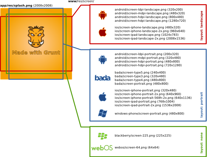
When creating mobile or tablet applications, your assets take time to load. Wether you prefer native or hybrid development, you end up customizing splashcreens for each of the screen resolutions, layout modes (portrait or landscape). This work is a bit cumbersome and no responsive technics exist in this field.

I have come up with a nice solution that takes a single PNG file as input. This file must be designed with every constraints in mind. Therefore, I also provide a canevas that helps out its creation:

Once done, using Grunt and my plugin grunt-phonegapsplash, creating all your required splashscreens is a matter of a single command line.

Here is the basic workflow that it automatically handles for you :

The canevas and the source file are available on Github. The plugin is easily installed via npm.

26 déc. 2013

Créer des icônes d'applications pour tablettes et mobiles à partir d'un SVG

A chaque fois que vous ciblez un nouvel OS pour applications mobiles et tablettes, il est nécessaire de produire plusieurs types d'icônes. Pour alléger ce travail fastidieux, j'ai publié un plugin pour Grunt.

Un petit graphique vaut mieux qu'un long discours :


Ce plugin s'appelle grunt-svg2storeicons. Son code source est disponible sur Github et disponible sous la forme d'un module npm.


15 déc. 2013

Faciliter l'intégration d'images responsives avec Grunt

Dernièrement, j'ai eu l'occasion de travailler avec Shiawuen sur une technique appelée Clowncar. Cette technique permet une intégration simple de vos images en mode responsive  : en fonction du périphérique (ordinateur, tablette ou modèle de smartphone), seul l'image dans sa résolution la plus appropriée est chargée. Cette technique est basée sur les articles d'Estelle Weyl.

En quoi consiste cette technique et ce plugin Grunt ?

Et bien, c'est assez futé et simple. Vous centralisez toutes vos photos (ou image pour votre site) dans un unique répertoire. Grunt et le plugin Grunt-Clowncar vont automatiquement créer un fichier SVG par photo (le 'car') et des miniatures (les 'clowns') de ces photos pour chaque résolution des périphériques visés.

Dans chaque SVG se trouve des directives de type media query permettant de pointer vers les miniatures en fonction des périphériques.

Au global, vous insérer les fichiers SVG tels de simples images dans votre page web. Automatiquement, le navigateur de votre périphérique ira chercher la miniature correspondante de la photo : la miniature est la plus appropriée à votre résolution. Nous sommes bien dans le cas d'images responsives mais en ne faisant qu'une petite ligne de code. Simple et efficace.

J'ai fait un petit 'livre de cuisine' (un cookbook) dispo ici : https://github.com/shiawuen/grunt-clowncar#cookbook.